


Navigating the complex world of options trading requires precise analysis and timely decision-making. Charting techniques emerge as an essential tool in this realm, empowering traders with visual insights into market trends and price movements. Each chart type flaunts unique advantages and drawbacks, necessitating a prudent selection to align with individual trading strategies. This comprehensive guide will delve into the intricacies of the best charts for options trading, equipping you with the knowledge to make informed choices.
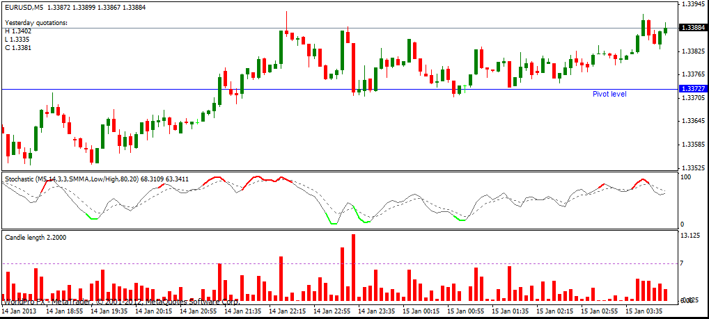
Image: www.binaryoptionsu.com
Bar Charts: Simplicity and Versatility
Bar charts, ingrained in the trading lexicon, offer a straightforward representation of price movements over a given time frame. Each bar portrays the opening, high, low, and closing prices, forming a visual depiction of market volatility and directionality. Their simplicity facilitates quick interpretation, making them a popular choice among novice and experienced traders alike.
Candlestick Charts: Illuminating Market Sentiment
Candlestick charts, inspired by Japanese rice traders, expand upon bar charts by incorporating color-coding to convey market sentiment. The body of a candlestick, whether hollow or filled, represents the price range between the open and close. A wick extends above and below the body, depicting the highest and lowest prices reached during the period. Red candlesticks indicate bearishness, signifying a closing price below the opening price, while green candlesticks reflect bullishness, with the closing price surpassing the opening price.
Line Charts: Establishing Trends and Support
Line charts simplify price data by connecting the closing prices of consecutive time periods, forming a line that charts the overall price trend. Their elegance enables traders to identify long-term trends, potential support and resistance levels, and areas of consolidation. Line charts excel in revealing market patterns that may not be readily apparent in other chart types.

Image: www.pinterest.com
Point and Figure Charts: Eliminating Noise
Point and figure charts, distinguished by their unique box-based construction, strip away price fluctuations to focus solely on significant movements. They disregard time, plotting only price changes that meet predetermined parameters, resulting in a chart uncluttered by short-term volatility. This filtering process lends itself to identifying potential trading opportunities based on established patterns and trend reversals.
Renko Charts: Combining Price and Time
Renko charts strike a balance between line charts and point and figure charts, utilizing brick-like formations to portray price action. Similar to point and figure charts, they filter out insignificant price movements by only plotting a new brick when a price change exceeds a predefined threshold. However, unlike point and figure charts, Renko charts incorporate time into their construction, ensuring a consistent horizontal spacing between bricks.
Range Bars: Measuring Volatility
Range bars diverge from conventional time-based charting methods, instead focusing on volatility in their construction. Each bar represents a predefined price range, rather than a specific time interval. This approach empowers traders with a nuanced understanding of market volatility, allowing them to identify periods of high or low volatility and strategize accordingly.
Heikin-Ashi Charts: Smoothing Price Action
Heikin-Ashi charts originate from Japanese candlestick charting techniques, combining multiple candlesticks into a single unit to mitigate the effects of market noise and enhance trend identification. Heikin-Ashi candlesticks incorporate modified calculations for their open, high, low, and close prices, producing a smoother and potentially more indicative representation of underlying market forces.
Volume Charts: Quantifying Market Activity
Volume charts augment price charts by incorporating volume data, providing insights into the intensity of trading activity associated with price movements. Above-average volume during a price surge signifies institutional involvement or increased market participation, while low volume may indicate a lack of conviction or a potential trend reversal. Understanding volume in conjunction with price action enhances decision-making and risk management.
Combining Charts for Enhanced Analysis
The efficacy of options trading often hinges on the ability to triangulate insights from multiple chart types. Combining different charts allows traders to corroborate observations, identify potential trading opportunities, and mitigate blind spots inherent in any single chart type. Bar charts, for instance, complement candlestick charts by offering a clearer view of open, high, and low prices, while volume charts amplify trading volume insights not readily discernible on price charts alone.
Best Charts For Options Trading
Conclusion: Unlocking Trading Success
Choosing the best charts for options trading empowers traders with the tools to decipher market movements and make informed decisions. Each chart type possesses unique advantages, rendering it suitable for different trading strategies and market conditions. Understanding the intricacies of these charts, and employing them in combination, unlocks a comprehensive perspective on market behavior, enhancing the likelihood of successful options trading outcomes.


